
For site owners
Brand your portal
Your name, your logos, your colour, your legal pages and the one setting you cannot undo.
Your advertisers should never see a brand that is not yours. Everything on this one page is what they see: the name in the tab, the logo above the login form, the colour on every button, the address they type in. Half an hour here is the difference between a tool you borrowed and a business you run.
Where it is
Branding, in the admin panel. One long page with a save button at the bottom of each card. Nothing takes effect until you save.
The name

Site name is the name of your ad network. It goes in the browser tab, at the top of every email your advertisers get, and in your terms and privacy pages.
Use the name of the business, not a description of what it does. "Northside Media" reads like a company. "Northside Media Advertising Platform" reads like a product page nobody wrote properly.
The pictures
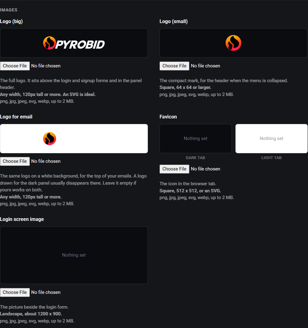
Every box tells you the size it wants, and none of them are required. What you skip falls back to something sensible.
| Upload | Where it appears | Make it |
|---|---|---|
| Logo (big) | Above the login and signup forms, and in the panel header. | Any width, 120px tall or more. An SVG is ideal. |
| Logo (small) | The header when the menu is collapsed. | Square, 64 x 64 or larger. |
| Logo for email | The top of your emails, on white. | Any width, 120px tall or more. |
| Favicon | The browser tab. | Square, 512 x 512, or an SVG. |
| Login screen image | Beside the login form. | Landscape, about 1200 x 900. |
The email logo is separate on purpose. The panel is dark, so a logo drawn in white looks right there and disappears completely at the top of an email, which is white. If your logo works on both backgrounds, leave the email one empty and the main logo is used.
PNG, JPG, JPEG, SVG or WEBP, up to 2 MB each.
The colour

Buttons, links, active tabs, progress bars and the focus ring. Leave it empty for the default orange.
Use the colour from your own logo. If you do not know the exact code, open
your logo file in any image editor and use the colour picker on it, or ask
whoever made it for the hex code. It looks like #f97316.
Pick something with a bit of punch. This colour is what tells somebody which thing on a page is the button, so a pale grey blue is a real usability problem and not just a dull choice. Reset to default puts it back if you dislike what you did.
The login screen
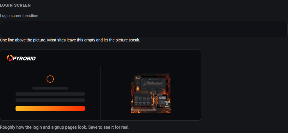
Login screen headline is one line above the picture. Most sites leave this empty and let the picture speak. If you do use it, say what somebody gets rather than welcoming them: "Reach 40,000 readers a month in the Northside" beats "Welcome to our advertising portal".
The preview underneath is roughly how the login and signup pages will look. Save to see it for real.
Support

Until you set one, your own email address is used. Set it to whatever you actually read. An address that bounces or goes unread is worse than no address at all, because somebody who was about to spend money with you has now been ignored.
Terms and privacy
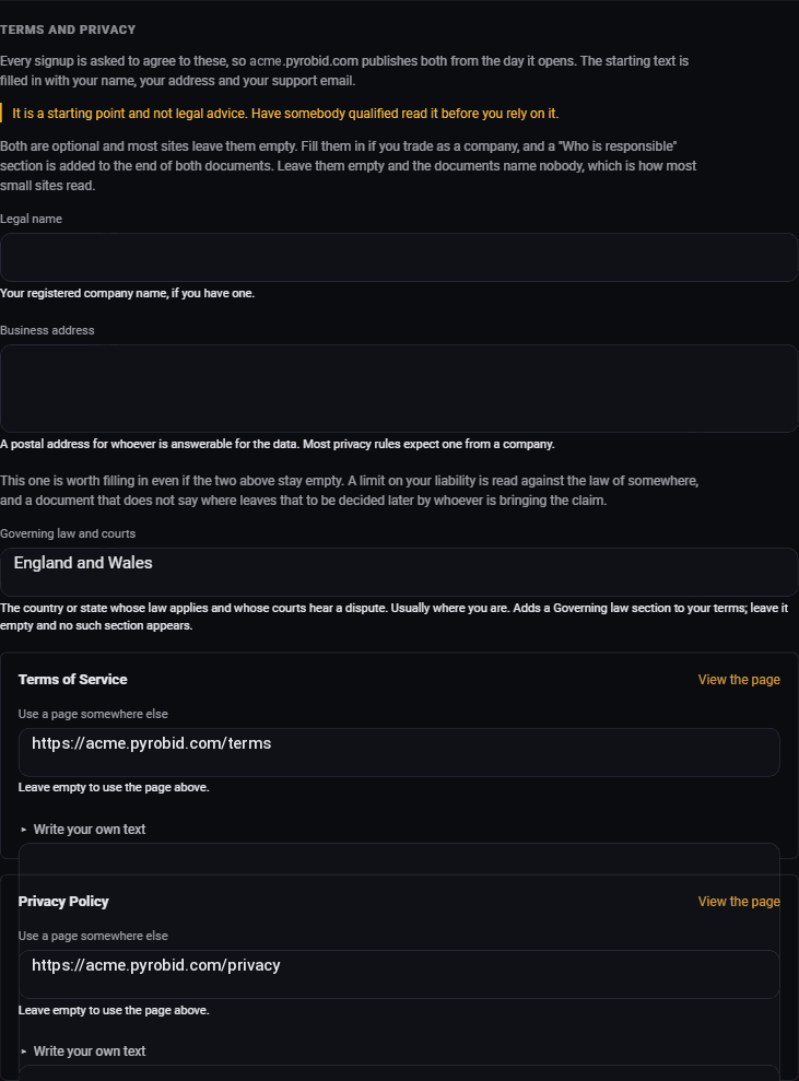
Every signup is asked to agree to these, so both are published from day one. The starting text is filled in with your name, your address and your support email.
It is a starting point and not legal advice. Have somebody qualified read it before you rely on it.
Three fields shape what those documents say:
- Legal name. Your registered company name, if you have one. Optional, and most small sites leave it empty.
- Business address. A postal address for whoever is answerable for the data. Most privacy rules expect one from a company.
- Governing law and courts. The country or state whose law applies and whose courts hear a dispute. Usually where you are.
Fill in the last one even if the first two stay empty. A limit on your liability is read against the law of somewhere, and a document that does not say where leaves that to be decided later by whoever is bringing the claim.
If you already have terms and a privacy policy on your main site, you can point at those instead by pasting the addresses in. Or write your own text in the boxes below each one.
Your site address
At the bottom of the page is the address your panel and your ad tags live at. While your network is empty you can still change it.
Once you add a site or a campaign it is fixed. By then the address is written into the tag on your publisher's site and the pixel on your advertiser's site, and neither of those is ours to edit. Changing it also signs you out, and you land on the login page at the new address.
So get this right early. It is the one thing on the page you cannot undo.
Your own domain
On the Pro plan, the card below it puts your panel on an address of your
own, like ads.yoursite.com. It takes one record in your
domain's DNS, and the card shows you the exact one to add.
Use your own domain walks through
it, DNS host by DNS host.
Save, then go and look

Then open your own login page in a private browsing window, the way a new advertiser would see it. Check the logo is not squashed, the colour looks right on the buttons, and the name in the tab is correct.
It takes two minutes and it catches the one thing that would otherwise sit there wrong for a month.
Where to go next
- Take payments, so advertisers can actually pay you.
- Get advertisers on board, now that the place looks like yours.
Run all of this on your own site.
Every screenshot above is the real product. Your advertisers see the same screens under your brand, and on your own domain from the Pro plan.
Start free trial14 days free. Your existing ads keep running. Cancel anytime.